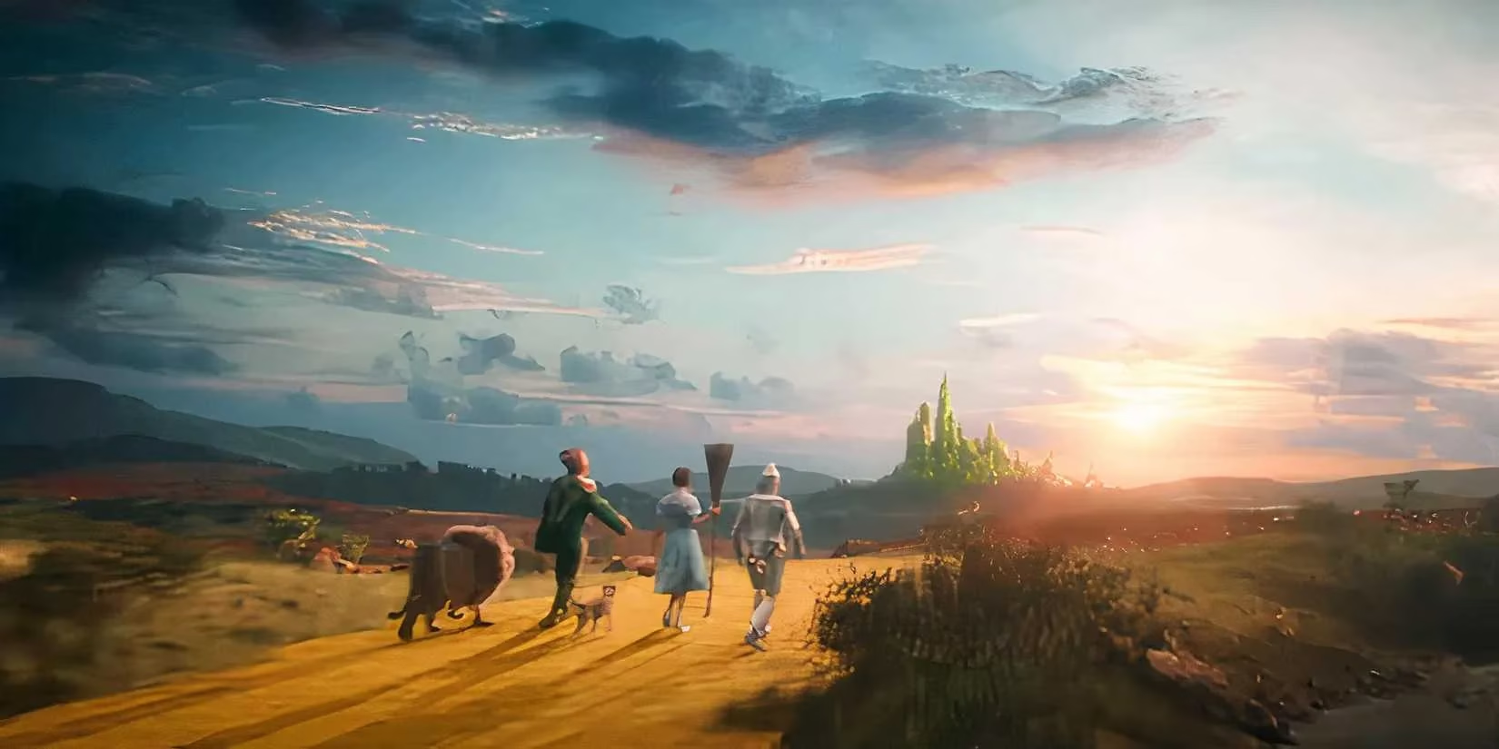
As a professional gamer and film buff, I've spent countless hours analyzing visual storytelling in games and movies, and when I watched Wicked last year after its November 2024 release, the first thing that struck me was its surprisingly desaturated look. 🎬 Unlike the vibrant Oz we all remember from classics like The Wizard of Oz, this adaptation felt almost gritty—like stepping into a world that's lost its spark. Director Jon M. Chu's choice to mute the colors wasn't a mistake; it was a bold move to make Oz feel real and lived-in, rather than some plastic fantasy. I mean, in my gaming sessions, I always appreciate when environments have weight and texture, and Chu nailed that here. He wanted us to feel the dirt underfoot and the wear on the buildings, as if the land itself is suffocating under the wizard's rule. If it had been all rainbows and glitter, the emotional stakes for Elphaba and Glinda just wouldn't hit home—it'd be like playing a game with maxed-out graphics but no soul. And honestly, after seeing it in theaters, I get it now: the dullness isn't a flaw; it's a feature that pulls you deeper into the story.
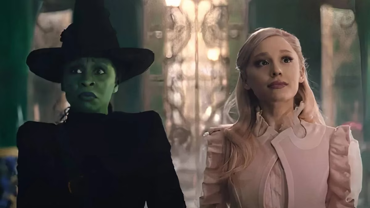
Chu's defense, which I read in that Globe and Mail interview, really resonated with me. He said the muted grading was deliberate to "immerse people into Oz" and "make it a real place," because if it felt fake or dreamlike, the high-stakes drama between Elphaba and Glinda wouldn't land. Think about it—in games, when a world is too polished, it loses tension. Here, Oz is withering away due to the wizard's sinister plan to suppress magic, and the lack of color visually screams that decay. It's not that the film skimps on color entirely; Glinda's pink costumes pop like crazy, and Elphaba's green skin stands out as a beacon of authenticity in a sea of lies. But overall, the palette is subdued to mirror the land's suffering. Chu even hinted that as Elphaba's story progresses, the color contrast will ramp up—symbolizing her role in reviving magic. That's genius level storytelling, folks. It reminds me of how in RPGs, environmental changes reflect character arcs, and I can't wait to see this unfold in Wicked Part II.
Now, let's break down why this works so well. The wizard, played by Jeff Goldblum, is a fraud with no real magic, and his rule is draining the life out of Oz. The desaturated look exposes his deception—it's like he's covering up the truth with flashy distractions, but the muted tones reveal the rot beneath. In The Wizard of Oz, Dorothy's tale painted Oz as a colorful paradise, but Wicked shows it's all a facade. This isn't just about aesthetics; it's a narrative tool. For instance, when you see scenes like the Dorothy cameo with the Cowardly Lion and others, the dullness makes it feel ironic and poignant. It's Chu's way of saying, "Hey, this world is broken, and we're not sugarcoating it." As a gamer, I love when media uses visuals to tell stories without words—it's like spotting environmental clues in a stealth game.
Key reasons behind the color choice, from my perspective:
-
🧩 Immersion over illusion: Chu wanted realism, not a cartoonish escape.
-
🌱 Symbolism of decay: The muted hues show Oz's decline under oppression.
-
🔮 Character-driven evolution: Colors will intensify with Elphaba's journey in the sequel.
Some viewers were disappointed, expecting a magical wonderland, but that's the point—it's meant to unsettle you. The wizard frames Elphaba as the villain, but the visuals tell a different story. It's a brilliant detail that, in 2025, still sparks debates. Personally, I think this approach elevates the film beyond a typical musical; it's a masterclass in visual narrative. Looking ahead, I'm super excited for Wicked Part II in 2026. I bet the color shift will be explosive, reflecting Elphaba's rise and the return of magic. It could inspire a new wave in fantasy films, where palettes aren't just pretty but purposeful. Imagine games adopting this—dynamic worlds that change with the story. That's the future I'm hyped for. ✨
In closing, Chu's vision for Wicked proves that sometimes, less color means more depth. It's a reminder that in storytelling, whether on screen or in games, authenticity trumps spectacle. I've rewatched it a few times since 2024, and each viewing reveals new layers—like how the sun's natural light in scenes adds to the realism. If you haven't seen it yet, do yourself a favor and dive in; it's a journey worth taking, even if it starts in shades of gray.
Comments