Color grading in film serves as a powerful storytelling tool, evoking emotions and defining worlds. Yet, when pushed too far, it risks becoming a distraction that pulls audiences out of the narrative rather than immersing them deeper. Filmmakers often employ vivid palettes to create signature aesthetics—think Wes Anderson’s whimsical coordination or the Wachowskis' cyberpunk greens. But bold choices can backfire, transforming visual poetry into jarring interference. The line between artistic bravery and overindulgence remains thin, as evidenced by several notable films where color dominated discourse at the expense of character and plot.
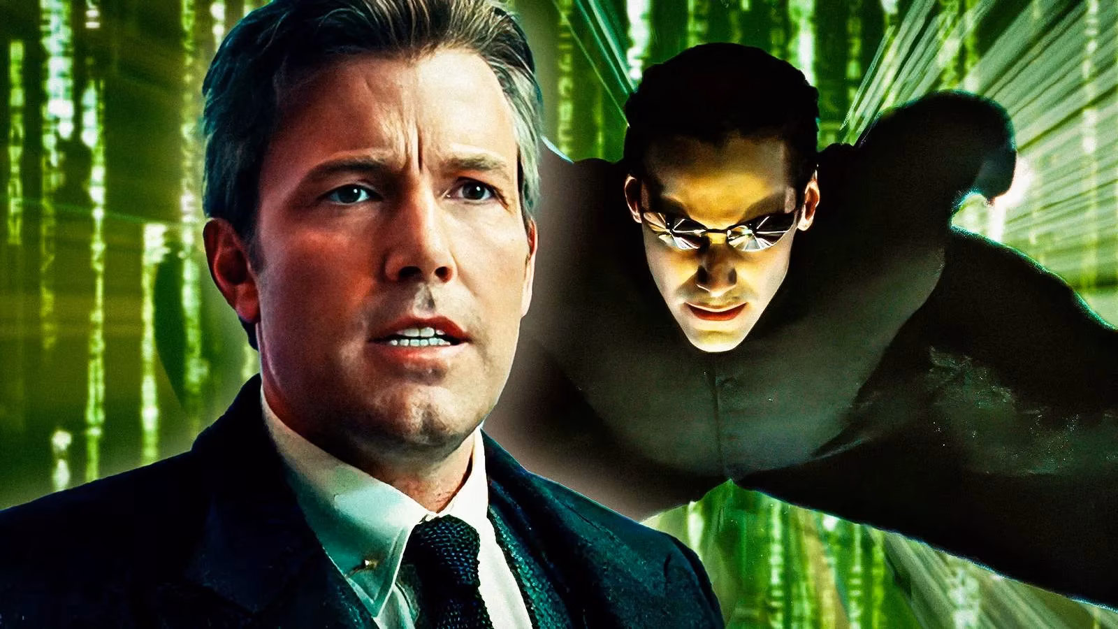
🎬 The Green Matrix Overload
The Matrix trilogy exemplifies this tension. While the original (1999) used subtle green undertones to hint at digital artifice, Reloaded and Revolutions (2003) amplified this to extremes. The pervasive green tint—rooted in tech symbolism—immersed viewers in the simulated reality but also created emotional distance from human characters. As Collider noted, the cascading green code became a visual metaphor for the Matrix’s programming, yet its intensity overshadowed Neo’s journey.
🦸 DC’s Monochrome Misstep
Zack Snyder’s Justice League (2017) faced criticism for its desaturated, near-monochrome palette. While aiming for gritty realism, the lack of comic-book vibrancy made action sequences feel sterile. Glaring green-screen moments (like Batman’s glowing eyes) further highlighted the disconnect between VFX and color grading, undermining the film’s cohesion.
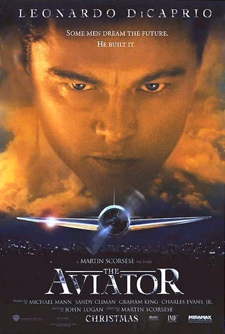
✈️ The Aviator’s Polarizing Palette
Martin Scorsese’s The Aviator (2004) used aggressive blue-and-orange grading to mirror Howard Hughes’ psychological state. Though innovative, the hyper-stylized hues—especially in early scenes—distanced audiences from Leonardo DiCaprio’s performance. The chromatic shifts reflected Hughes’ mental unraveling but often felt like an academic exercise rather than an emotional conduit.
🏎️ Speed Racer’s Dated Dazzle
The Wachowskis’ Speed Racer (2008) embraced manga-inspired explosions of color, with each character and locale drenched in neon. While daring, the relentless saturation competed with the story’s emotional beats. Though reevaluated as a visual pioneer, its palette often overwhelmed the family-driven narrative.
🍫 Wonka’s Divisive Darkness
Tim Burton’s Charlie and the Chocolate Factory (2005) traded Roald Dahl’s whimsy for gothic teals and browns. The cohesive but gloomy aesthetic—divisive among fans—prioritized Burton’s signature style over the source material’s charm, making the factory feel eerie rather than enchanting.
🌊 In the Heart of the Sea’s Chromatic Whiplash
Ron Howard’s seafaring epic (2015) used teal oceans and sudden orange shifts to depict crew desperation. Yet these jarring transitions diluted the survival stakes, rendering harrowing moments oddly artificial. The attempt at period authenticity via a yellow filter further muddied the visuals.
✨ Fantasy Films: When Magic Fades
-
Peter Pan (2003): Vibrant skies and fairy-dance golds charmed but clashed with dated VFX, exposing artifice.
-
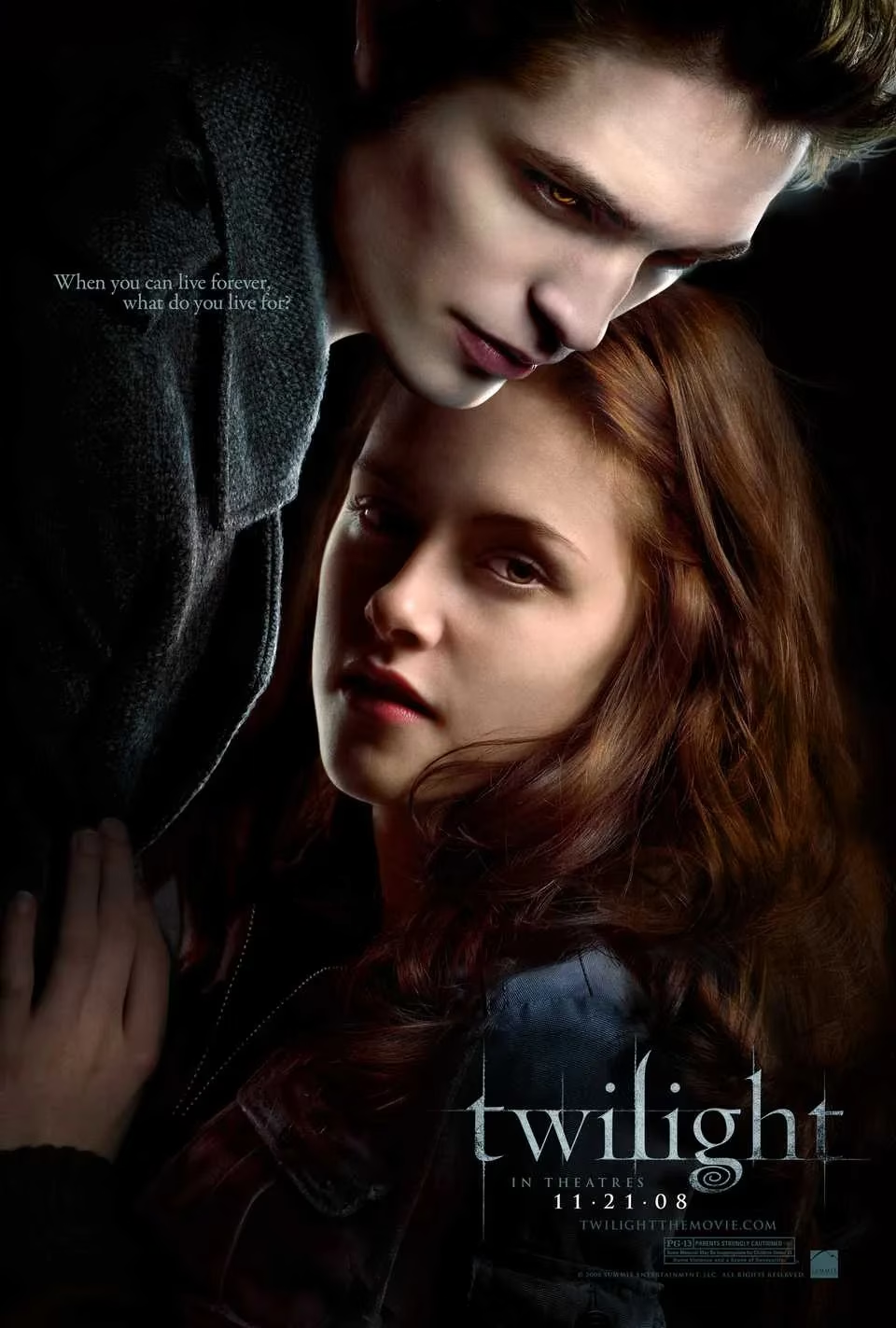
Twilight (2008): The iconic blue filter mirrored Edward’s cold allure but desaturated emotional depth. Later sequels warmed the palette as Bella embraced vampirism, proving color must evolve with character.
-
Harry Potter and the Half-Blood Prince (2009): Excessive darkness obscured key scenes (like Dumbledore’s cave death), sacrificing clarity for mood.
-
Into the Woods (2014): Blue-drenched woods blurred Meryl Streep’s Witch into the background, complicating her hunt for colorful plot-critical items.
💡 Why Color Matters: A Visual Language
Color theory isn’t arbitrary—green signals artificiality, blue evokes detachment, and monochrome suggests grim realism. But when grading oversaturates or desaturates without narrative synergy, it shouts where it should whisper. As The Aviator and Justice League prove, even masters like Scorsese and Snyder can misstep. The best palettes serve the story; the worst hijack it.
❓ FAQ: Color Grading in Film
Q: Why do filmmakers use extreme color grading?
A: To establish tone, symbolize themes, or create iconic visuals. For example, The Matrix’s green represents digital control.
Q: When does it enhance vs. distract?
A: It enhances when cohesive (Wes Anderson’s pastels). It distracts when inconsistent (Justice League’s VFX clashes) or overwhelming (Speed Racer’s neon).
Q: Can color affect emotional engagement?
A: Absolutely. Twilight’s blue filter emphasized alienation but numbed warmth, while Half-Blood Prince’s darkness literally hid performances.
Q: Are there recent trends in color grading?
A: By 2025, many films balance bold palettes with restraint—using AI-assisted grading to ensure hues complement, not compete with, storytelling.
Q: What’s the biggest takeaway?
A: Color should deepen immersion, not become the conversation. As these films show, audiences remember feelings, not filters.
Comments